Alicia Brooks Design

Work
About
Time Inc. Creating a design system

Case Study
Introduction
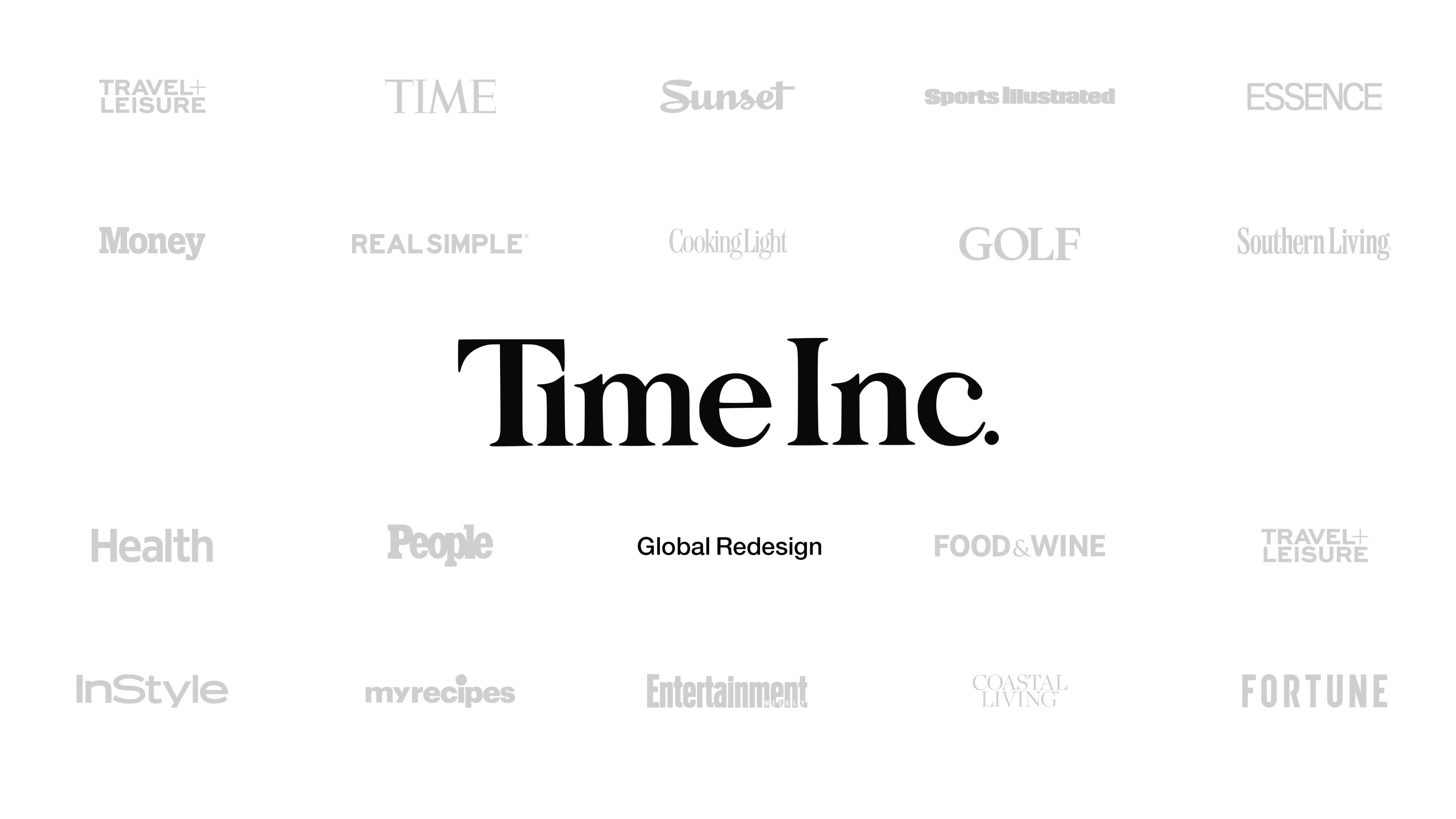
As a Product Design Consultant at Time Inc., I collaborated with a Product Owner, UX Strategist and a Creative Director to design and implement a centralized design system that replaced the fragmented work of over 30 brand-specific designers. Our lean, high-impact team built a cohesive system that served over 10 digital brands — including Time, Fortune, InStyle, Food & Wine, Essence, Real Simple, and more. We unified visual language, increased design and dev efficiency, and laid the groundwork for scalable, component-based design across the entire portfolio.

Skills used
Design Systems (Atomic Design)
Digital Transformation & Scalable Systems
Agile Methodologies & Design Ops
UX & UI Design
Information Architecture, Visual Design, Typography
Inclusive & Accessible Design
Agile Workflows, QA
Role
Design Consultant
Team
Product owner, UX Strategist, Creative Director, 7 Developers
Timeline
6 months
Tools
Sketch, Jira, Photoshop, Illustrator, Storybook
Context
Scope
- Global Tool
- 70k sites created
- 14m sessions/mo
Features
- Article pages
- Sign-in flows
- Slideshows
- Recipe pages
- Browse & search functions
- Recirculation modules
Brands
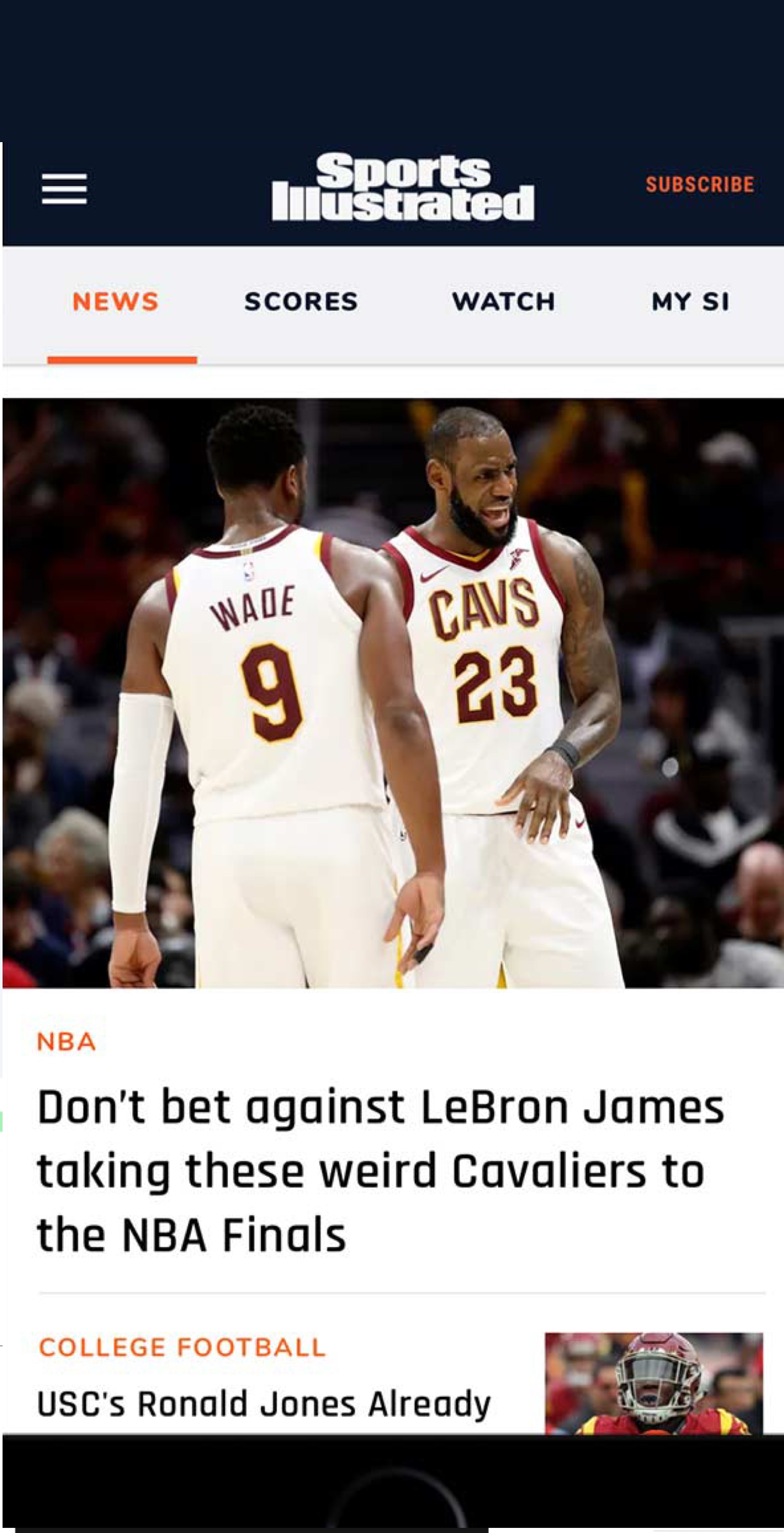
- Travel + Leisure
- Time
- Sunset
- Sports Illustrated
- Essence
- Money
- Real Simple
- Golf
- People
- Food & Wine
- InStyle
- Entertainment Weekly
Design Process
Goals
Create a unified, scalable design system that could serve multiple Time Inc. brands while preserving their unique identities. We aimed to streamline design and development by consolidating UI patterns into a shared component library, improving cross-team efficiency, and reducing inconsistencies. Clear documentation and developer-ready specs ensured a smoother handoff and more consistent implementation across platforms.
Research
User Research
Before creating the system, we analyzed the design and UX pain points across all Time Inc. properties:
- Conducted a cross-brand design audit, comparing existing patterns, visual styles, and technical inconsistencies.
- Interviewed internal stakeholders — including brand teams, developers, and product managers — to understand workflow challenges and site-specific requirements.
- Mapped out competing goals between editorial teams and business leads to ensure the design system would meet both brand expression and platform consistency needs.
Key Findings
Each brand had been operating in a design silo, reinventing similar components in slightly different ways — slowing down development, bloating QA, and creating friction for users navigating across Time Inc.'s ecosystem. Editorial teams wanted more agility and consistency without sacrificing brand expression.
UX
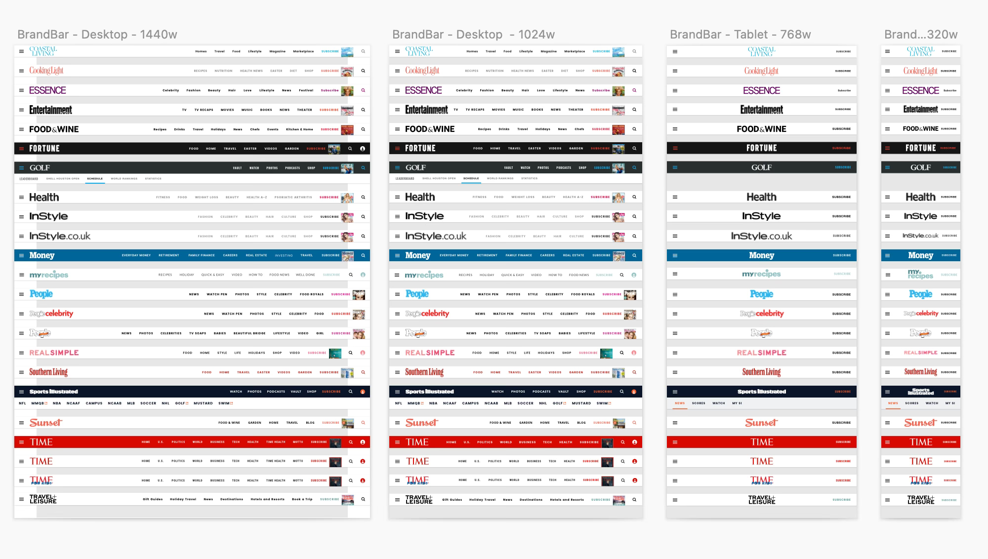
Component inventory
- System-wide digital component library created (core + brand-specific variants).
- The UX Lead catalogued UI elements, layouts, and templates across all brands, flagging visual inconsistencies and structural overlaps.
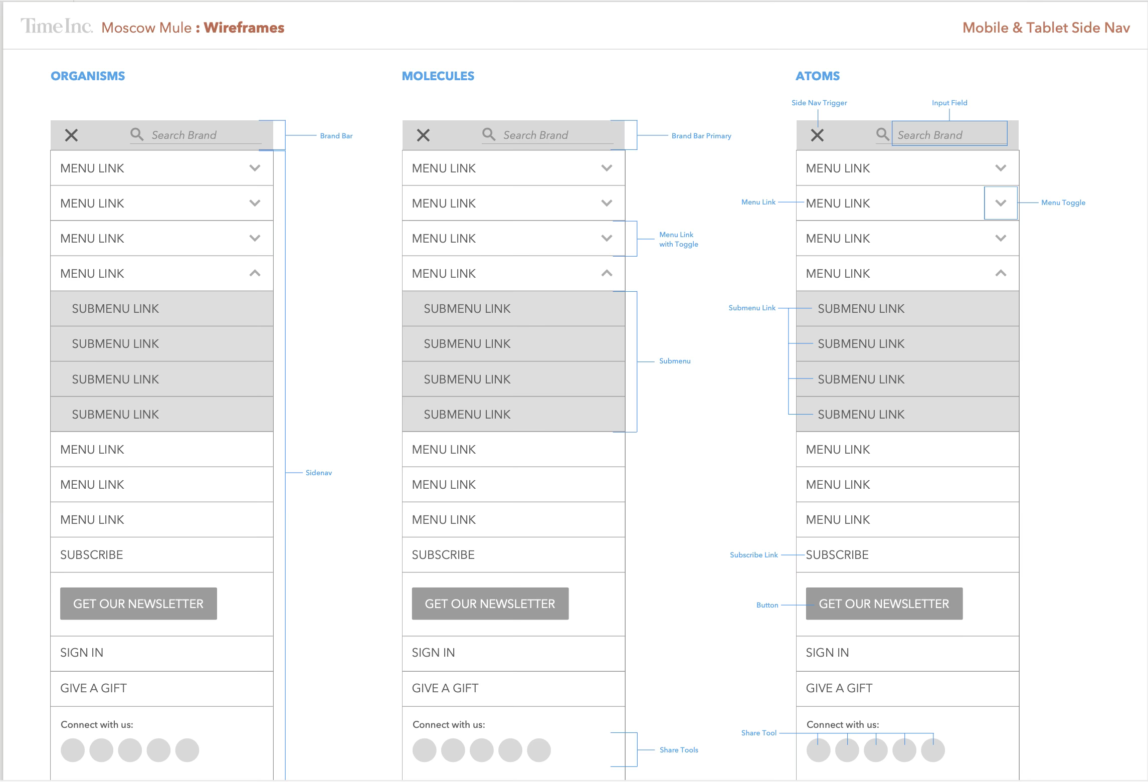


Design System Creation
I worked with one other designer on the visual design system development, establishing:
- Shared typography scales, grid systems, and color tokens
- Modular UI components (e.g., navigation, article cards, hero layouts) adaptable for brand-specific needs
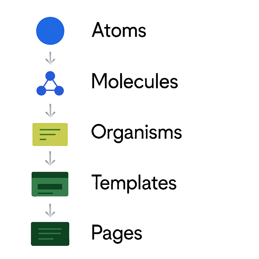
- A system architecture grounded in Atomic Design principles for scalability and reuse
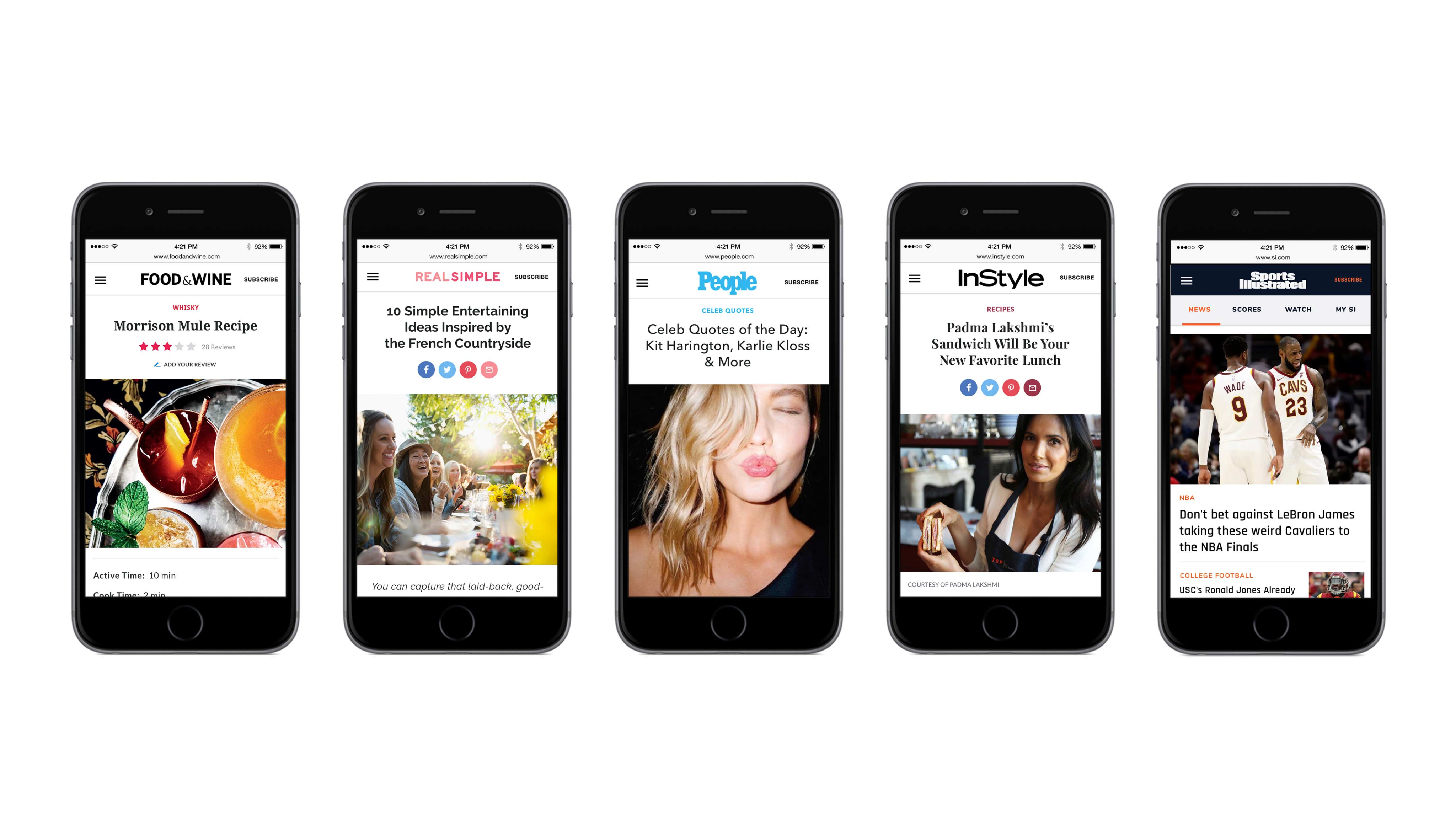
Cross-Brand AdaptabilityEach component was designed to be flexible and brand-aware — using themeable styling and variable tokens so that, for example, Essence could feel distinct from Time, while still drawing from the same core system.
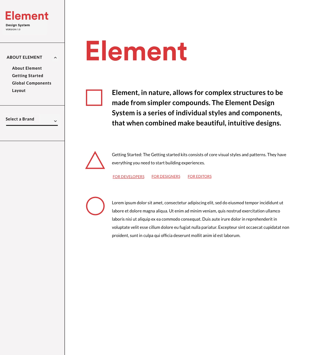
Living Documentation
We produced developer-ready visual specs, collaborated on front-end implementation, and aligned with engineering on web standards to ensure seamless rollout.
Element living documentation
Outcome
90%
Reduction in redundant design work
With a centralized component library, designers spent less time recreating patterns and more time on higher-value creative tasks.
↑
Increase in consistency across brands
Visual and interaction inconsistencies across Time Inc. brands were significantly reduced through shared styles and components
↑
Better accessibility outcomes
Designing from the ground up allowed accessibility to be baked in, leading to improved compliance and usability across audiences.
↑
Faster Adoption of New Features Across Brands
With a shared design system in place, new features and updates could be rolled out consistently and efficiently across multiple Time Inc. brands—reducing implementation time and ensuring a cohesive user experience at scale.

Reflections
Small teams
→ A small, aligned team can outperform large, siloed orgs when strategy and systems are clear.
Systems thinking works
→ Atomic Design was a game-changer, allowing us to create modular, adaptable components that flexed to brand needs without sacrificing system integrity.
→ Designing across a portfolio forced us to balance consistency and creative freedom — a tension we solved with smart theming and thoughtful documentation.
Cross-Team Input Was Essential
→ Creating a truly functional system meant collaborating across editorial, product, and engineering to capture every use case. Each component had to be flexible enough to work across brands, yet specific enough to meet individual team needs. This deep cross-functional input ensured the system was both adaptable and widely adopted.
Changes
→ If given more time, I would have introduced training workshops and a governance model to ensure continued adoption and long-term success.
Thank you!
Next case study >
Get in touch
Connect with me to learn more.
Work
➔
About
➔
➔
@ Alicia Brooks
2025
All Rights Reserved
Work
About
Time Inc.
Creating a design system
Case Study
Introduction
As a Product Design Consultant at Time Inc., I collaborated with a Product Owner, UX Strategist and a Creative Director to design and implement a centralized design system that replaced the fragmented work of over 30 brand-specific designers. Our lean, high-impact team built a cohesive system that served over 10 digital brands — including Time, Fortune, InStyle, Food & Wine, Essence, Real Simple, and more. We unified visual language, increased design and dev efficiency, and laid the groundwork for scalable, component-based design across the entire portfolio.
Skills used
Design Systems (Atomic Design)
Digital Transformation & Scalable Systems
Agile Methodologies & Design Ops
UX & UI Design
Information Architecture, Visual Design, Typography
Inclusive & Accessible Design
Agile Workflows, QA
Role
Design Consultant
Team
Product owner, UX Strategist, Creative Director, 7 Developers
Timeline
6 months
Tools
Sketch, Jira, Photoshop, Illustrator, Storybook
Context
Scope
- Global Tool
- 70k sites created
- 14m sessions/mo
Features
- Article pages
- Sign-in flows
- Slideshows
- Recipe pages
- Browse & search functions
- Recirculation modules
Brands
- Travel + Leisure
- Time
- Sunset
- Sports Illustrated
- Essence
- Money
- Real Simple
- Golf
- People
- Food & Wine
- InStyle
- Entertainment Weekly
Design Process
Goals
Create a unified, scalable design system that could serve multiple Time Inc. brands while preserving their unique identities. We aimed to streamline design and development by consolidating UI patterns into a shared component library, improving cross-team efficiency, and reducing inconsistencies. Clear documentation and developer-ready specs ensured a smoother handoff and more consistent implementation across platforms.
Research
User Research
Before creating the system, we analyzed the design and UX pain points across all Time Inc. properties:
- Conducted a cross-brand design audit, comparing existing patterns, visual styles, and technical inconsistencies.
- Interviewed internal stakeholders — including brand teams, developers, and product managers — to understand workflow challenges and site-specific requirements.
- Mapped out competing goals between editorial teams and business leads to ensure the design system would meet both brand expression and platform consistency needs.
Key Findings
Each brand had been operating in a design silo, reinventing similar components in slightly different ways — slowing down development, bloating QA, and creating friction for users navigating across Time Inc.'s ecosystem. Editorial teams wanted more agility and consistency without sacrificing brand expression.
UX
Component inventory
- System-wide digital component library created (core + brand-specific variants).
- The UX Lead catalogued UI elements, layouts, and templates across all brands, flagging visual inconsistencies and structural overlaps.
Design System Creation
I worked with one other designer on the visual design system development, establishing:
- Shared typography scales, grid systems, and color tokens
- Modular UI components (e.g., navigation, article cards, hero layouts) adaptable for brand-specific needs
- A system architecture grounded in Atomic Design principles for scalability and reuse
Cross-Brand AdaptabilityEach component was designed to be flexible and brand-aware — using themeable styling and variable tokens so that, for example, Essence could feel distinct from Time, while still drawing from the same core system.
Living Documentation
We produced developer-ready visual specs, collaborated on front-end implementation, and aligned with engineering on web standards to ensure seamless rollout.
Element living documentation
Outcome
90%
Reduction in redundant design work
With a centralized component library, designers spent less time recreating patterns and more time on higher-value creative tasks.
↑
Increase in consistency across brands
Visual and interaction inconsistencies across Time Inc. brands were significantly reduced through shared styles and components
↑
Better accessibility outcomes
Designing from the ground up allowed accessibility to be baked in, leading to improved compliance and usability across audiences.
↑
Faster Adoption of New Features Across Brands
With a shared design system in place, new features and updates could be rolled out consistently and efficiently across multiple Time Inc. brands—reducing implementation time and ensuring a cohesive user experience at scale.
Reflections
Small teams
→ A small, aligned team can outperform large, siloed orgs when strategy and systems are clear.
Systems thinking works
→ Atomic Design was a game-changer, allowing us to create modular, adaptable components that flexed to brand needs without sacrificing system integrity.
→ Designing across a portfolio forced us to balance consistency and creative freedom — a tension we solved with smart theming and thoughtful documentation.
Cross-Team Input Was Essential
→ Creating a truly functional system meant collaborating across editorial, product, and engineering to capture every use case. Each component had to be flexible enough to work across brands, yet specific enough to meet individual team needs. This deep cross-functional input ensured the system was both adaptable and widely adopted.
Changes
→ If given more time, I would have introduced training workshops and a governance model to ensure continued adoption and long-term success.
Thank you!
Next case study >
Get in touch
Connect with me to learn more.
Work
➔
About
➔
➔
@ Alicia Brooks
2025
All Rights Reserved
Work
About
Time Inc.
Creating a design system
Case Study
Introduction
As a Product Design Consultant at Time Inc., I collaborated with a Product Owner, UX Strategist and a Creative Director to design and implement a centralized design system that replaced the fragmented work of over 30 brand-specific designers. Our lean, high-impact team built a cohesive system that served over 10 digital brands — including Time, Fortune, InStyle, Food & Wine, Essence, Real Simple, and more. We unified visual language, increased design and dev efficiency, and laid the groundwork for scalable, component-based design across the entire portfolio.
Role
Design Consultant
Team
Product owner, UX Strategist, Creative Director, 7 Developers
Timeline
6 months
Tools
Sketch, Jira, Photoshop, Illustrator, Storybook
Skills used
Design Systems (Atomic Design)
Digital Transformation & Scalable Systems
Agile Methodologies & Design Ops
UX & UI Design
Information Architecture, Visual Design, Typography
Inclusive & Accessible Design
Agile Workflows, QA
Context
Scope
- Global Tool
- 70k sites created
- 14m sessions/mo
Features
- Article pages
- Sign-in flows
- Slideshows
- Recipe pages
- Browse & search functions
- Recirculation modules
Brands
- Travel + Leisure
- Time
- Sunset
- Sports Illustrated
- Essence
- Money
- Real Simple
- Golf
- People
- Food & Wine
- InStyle
- Entertainment Weekly
Design Process
Goals
Create a unified, scalable design system that could serve multiple Time Inc. brands while preserving their unique identities. We aimed to streamline design and development by consolidating UI patterns into a shared component library, improving cross-team efficiency, and reducing inconsistencies. Clear documentation and developer-ready specs ensured a smoother handoff and more consistent implementation across platforms.
Research
User Research
Before creating the system, we analyzed the design and UX pain points across all Time Inc. properties:
- Conducted a cross-brand design audit, comparing existing patterns, visual styles, and technical inconsistencies.
- Interviewed internal stakeholders — including brand teams, developers, and product managers — to understand workflow challenges and site-specific requirements.
- Mapped out competing goals between editorial teams and business leads to ensure the design system would meet both brand expression and platform consistency needs.
Key Findings
Each brand had been operating in a design silo, reinventing similar components in slightly different ways — slowing down development, bloating QA, and creating friction for users navigating across Time Inc.'s ecosystem. Editorial teams wanted more agility and consistency without sacrificing brand expression.
UX
Component inventory
- System-wide digital component library created (core + brand-specific variants).
- The UX Lead catalogued UI elements, layouts, and templates across all brands, flagging visual inconsistencies and structural overlaps.
Design System Creation
I worked with one other designer on the visual design system development, establishing:
- Shared typography scales, grid systems, and color tokens
- Modular UI components (e.g., navigation, article cards, hero layouts) adaptable for brand-specific needs
- A system architecture grounded in Atomic Design principles for scalability and reuse
Cross-Brand AdaptabilityEach component was designed to be flexible and brand-aware — using themeable styling and variable tokens so that, for example, Essence could feel distinct from Time, while still drawing from the same core system.
Living Documentation
We produced developer-ready visual specs, collaborated on front-end implementation, and aligned with engineering on web standards to ensure seamless rollout.
Element living documentation
Outcome
90%
Reduction in redundant design work
With a centralized component library, designers spent less time recreating patterns and more time on higher-value creative tasks.
↑
Increase in consistency across brands
Visual and interaction inconsistencies across Time Inc. brands were significantly reduced through shared styles and components
↑
Better accessibility outcomes
Designing from the ground up allowed accessibility to be baked in, leading to improved compliance and usability across audiences.
↑
Faster Adoption of New Features Across Brands
With a shared design system in place, new features and updates could be rolled out consistently and efficiently across multiple Time Inc. brands—reducing implementation time and ensuring a cohesive user experience at scale.
Reflections
Small teams
→ A small, aligned team can outperform large, siloed orgs when strategy and systems are clear.
Systems thinking works
→ Atomic Design was a game-changer, allowing us to create modular, adaptable components that flexed to brand needs without sacrificing system integrity.
→ Designing across a portfolio forced us to balance consistency and creative freedom — a tension we solved with smart theming and thoughtful documentation.
Cross-Team Input Was Essential
→ Creating a truly functional system meant collaborating across editorial, product, and engineering to capture every use case. Each component had to be flexible enough to work across brands, yet specific enough to meet individual team needs. This deep cross-functional input ensured the system was both adaptable and widely adopted.
Changes
→ If given more time, I would have introduced training workshops and a governance model to ensure continued adoption and long-term success.
Thank you!
Next case study >
Get in touch
Connect with me to learn more.
Work
➔
About
➔
➔
@ Alicia Brooks
2025
All Rights Reserved