Alicia Brooks Design

Work
About
Creating The Cut
A new fashion destination for New York Magazine

Case Study
Introduction
While at New York Magazine, I created the visual design and digital branding for The Cut — a sharp, stylish, and culturally resonant digital destination. Originally launched as a fashion blog, The Cut became a stand-alone vertical in 2012, and by 2017 had broadened its scope to include Style, Self, Culture, and Power — a deliberate editorial shift beyond fashion. My work was central to this transformation. Partnering closely with the Creative Director, Product Owners, and Editorial leadership (including then-editorial director Stella Bugbee and Editor-in-Chief Adam Moss), I helped define The Cut's digital identity, structure, and voice — ensuring it stood apart from both traditional fashion magazines and lifestyle blogs.

Role
Lead designer, 4 person design team
Team
4 Designers, 7 Developers, 1 Product Owner, 1 Dev Lead
Timeline
2 months (4 sprints)
Tools
Figma, Mural, Jira, Storybook, IBM Carbon Design System
Scope of work
- Product + Visual + UX Designer
- Designed visual identity (logo, typography, color, layout, illustration style)
- Editorial UX patterns and responsive systems
- Designed visual identity (logo, typography, color, layout, illustration style)
- Editorial UX patterns and responsive systems
- UX & Homepage and content taxonomy for the new sections: Style, Self, Culture, Power
- Design system to support editorial workflows
- Collaborative reviews with editorial leadership
Project Goals
01
Brand The Cut as a distinct digital vertical under New York Magazine
02
Reflect its expanded editorial focus beyond fashion
03
Establish a bold, mobile-first design system
04
Compete with established fashion media while offering substantive, feminist, and culturally aware content
05
Increase engagement through editorial flexibility and strong visual storytelling
Design Process
Editorial driven Branding
Responsive Architecture
UX
Design for CMS-Compatible Flexibility
Quality Assurance
Research
Competitive audit
Competitive audit of fashion and culture sites to find white space
Editorial interviews
Editorial interviews to define tone, voice, and structure
Technical Req
- Technical constraints analysis for responsive performance
- UX research to map reader engagement habits on mobile
Key Findings
The Cut’s editorial POV demanded a design that was both polished and pointed — with room for both fashion galleries and serious journalism.
Branding
Visual Identity / Logo
Unlike traditional fashion publications, The Cut didn’t just cover trends — it offered a witty, unfiltered take on power, identity, and culture. The brand voice was:
- Intelligent but approachable
- Playfully provocative, yet journalistically rigorous
- Comfortable covering both lipstick and legislation, often in the same breath
Design needed to reflect this editorial ethos — strong, clean, bold, and flexible enough to house everything from fashion week recaps to longform essays on politics, power, and gender.
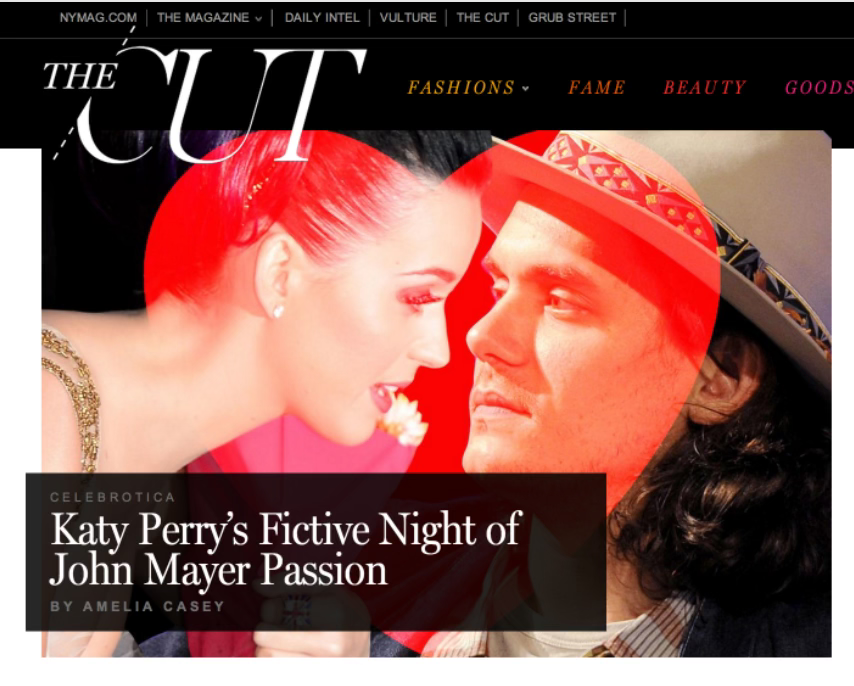
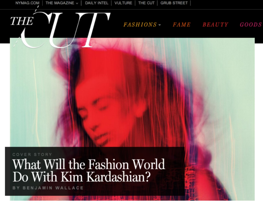
Logo:
All-caps, serif, and unapologetically bold. The logo felt classic but with a modern bite—anchoring the brand as both fashion-forward and intellectually serious.
Typography:
A confident mix of high-contrast serifs and clean sans-serifs created tension and elegance, echoing the way The Cut tackled soft lifestyle topics with hard-edged analysis.
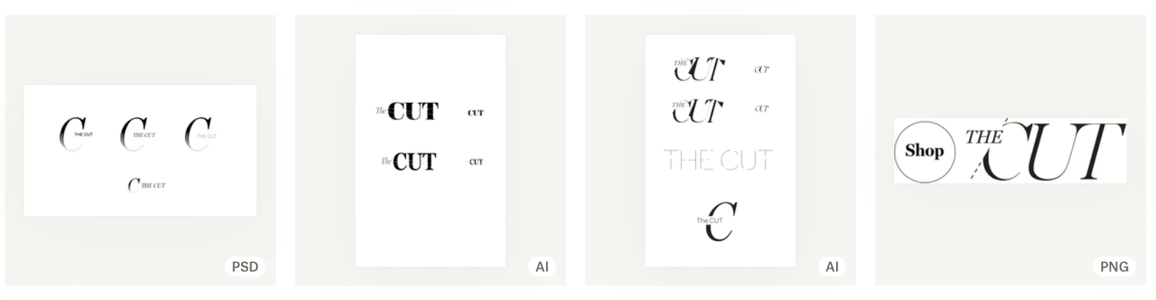
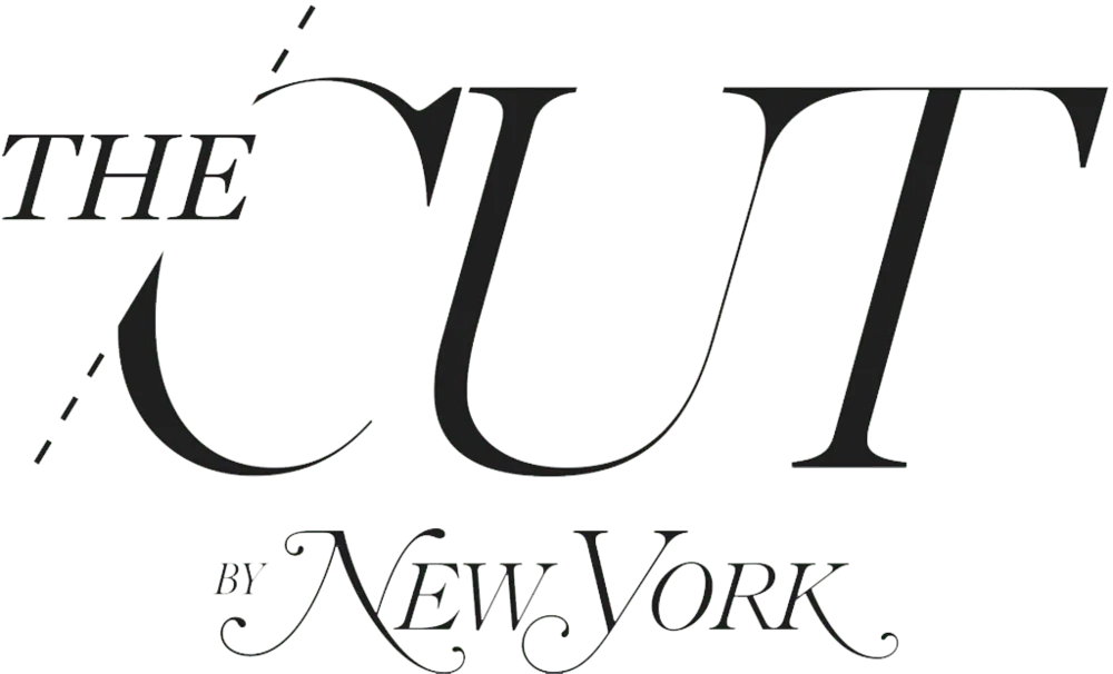
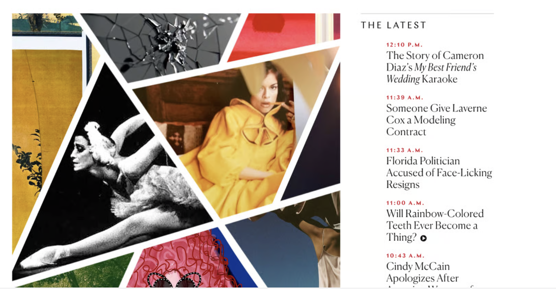
Photo illustration style
We developed a bold, expressive illustration style that reflects The Cut’s position as a cutting-edge destination for fashion and culture. These illustrations go beyond decoration—they act as visual storytelling tools that deepen editorial impact and foster emotional connection.
- The style amplifies the brand’s voice: unapologetically bold, intellectually provocative, and visually magnetic—perfect for an audience that embraces both high fashion and cultural critique.
- Edgy & Inclusive: The illustrations reflect The Cut’s diverse and progressive ethos, embracing complexity over perfection.
- Vibrant, High-Contrast Color: A saturated palette—reds, pinks, purples, and rich neutrals—echoes the brand’s fearless tone and high-energy editorial rhythm.
- Expressive, Dynamic Figures: Loosely rendered, stylized forms celebrate individuality, movement, and attitude—challenging the conventions of traditional fashion illustration.
- Playful Yet Polished: Often incorporating collage, ink, or hand-drawn textures, the illustrations strike a balance between raw creativity and editorial sophistication.
- Together, this approach created a visual language as distinctive and multidimensional as The Cut itself, capable of elevating both a fashion week recap and a sharp essay on gender politics.
User Experience
Responsive Architecture
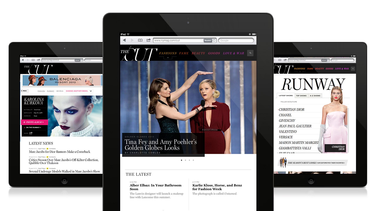
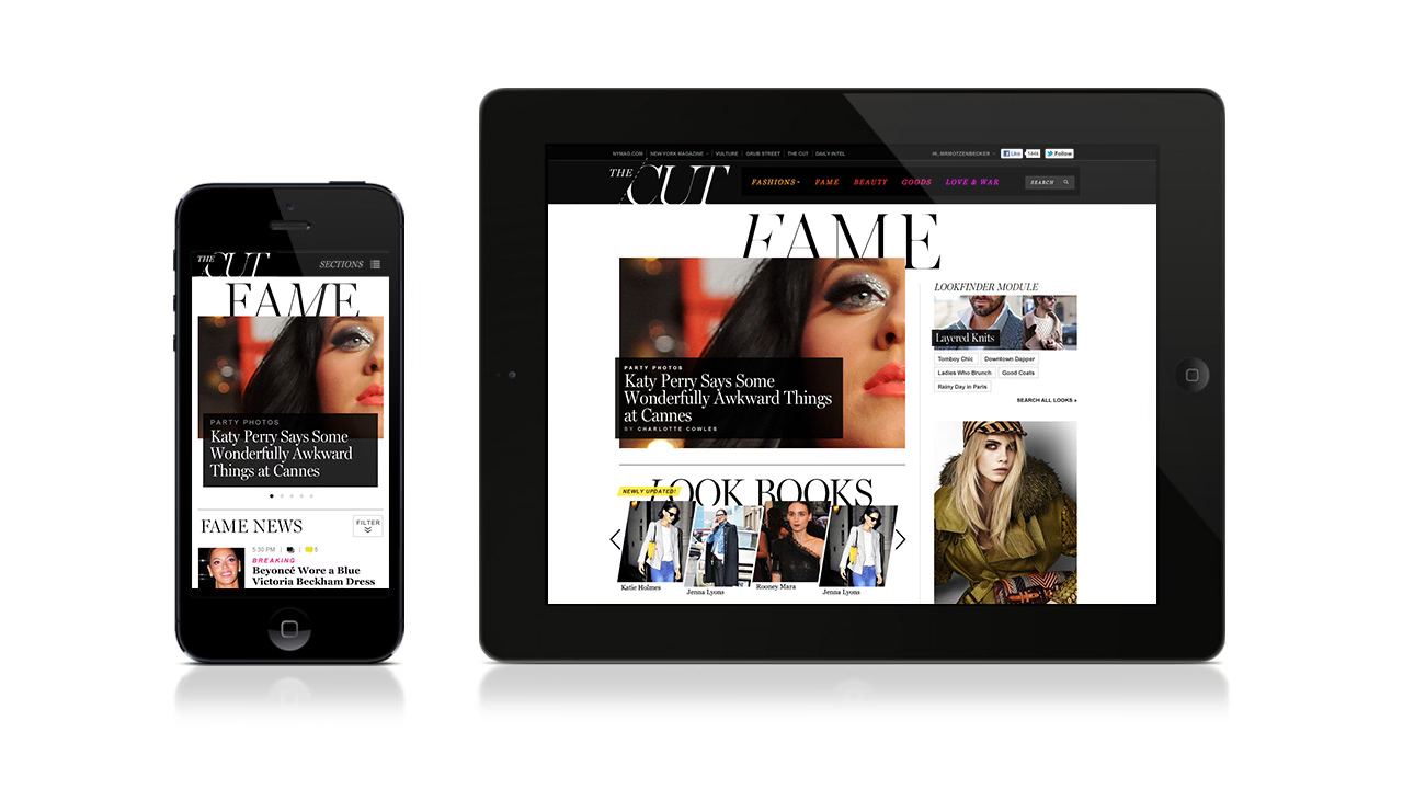
- Designed a mobile-first interface (ahead of trend in 2017).
- Created templates that worked for both quick hits and deep reads.
Section Identity & UX
- Introduced clear navigational structures for Style, Self, Culture, Power.
- Ensured each section had a distinct editorial rhythm but consistent design patterns.
CMS-Compatible Flexibility
- Designed with editorial usability in mind — allowing non-designers to build compelling layouts easily.
Layout Choices
Layered Typography & Layout
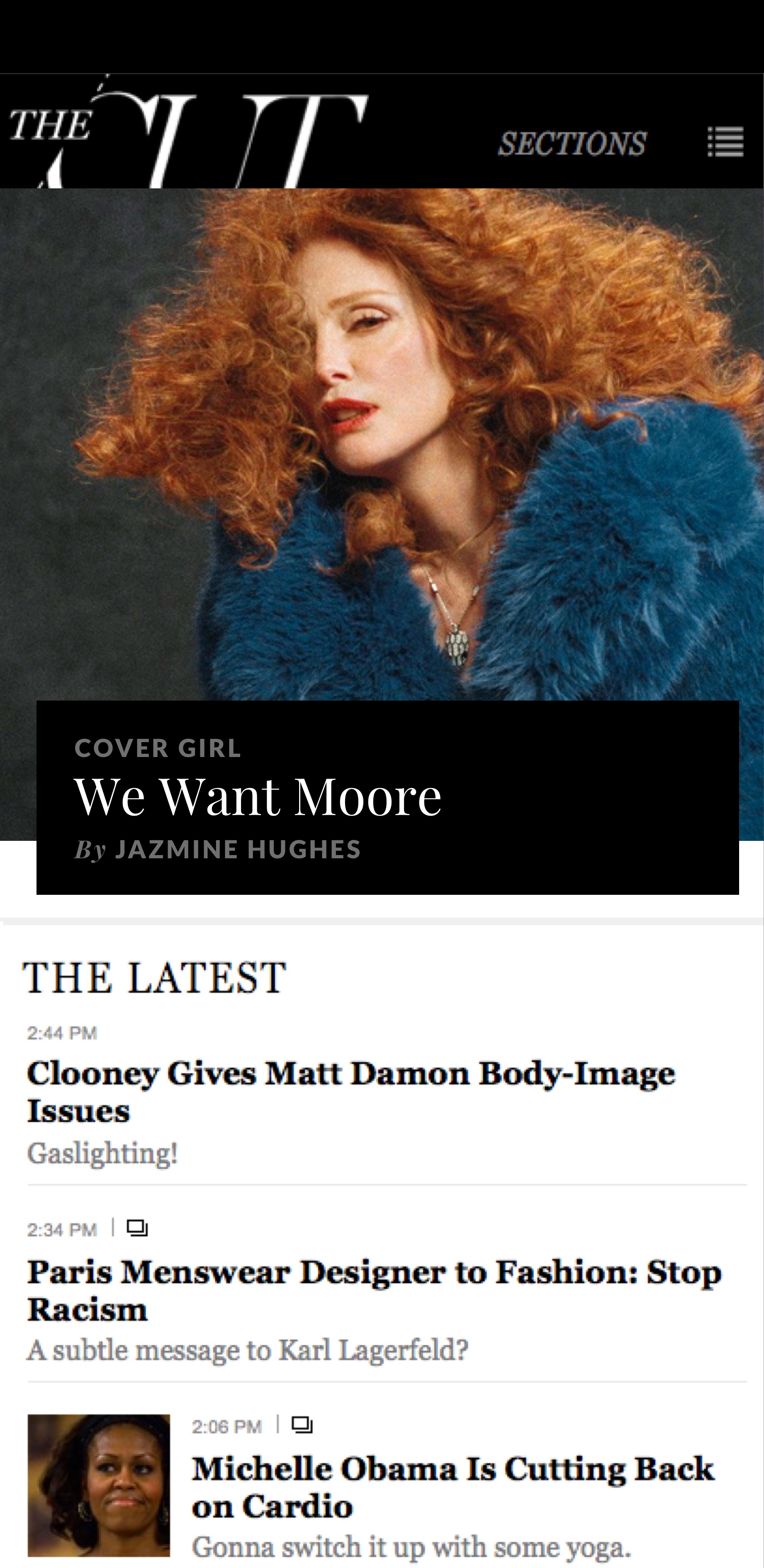
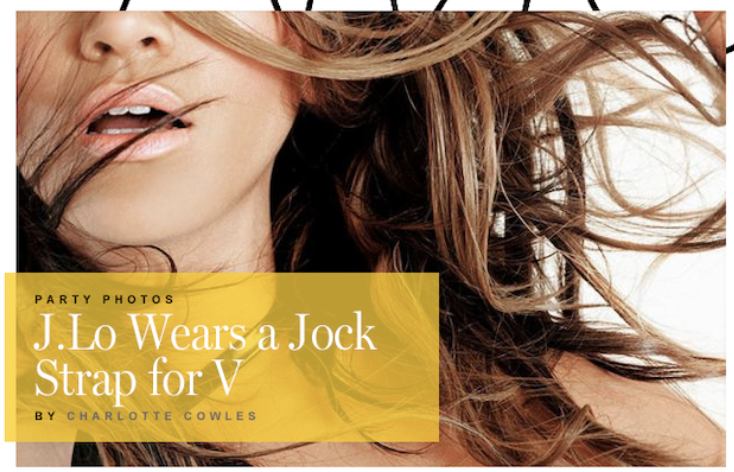
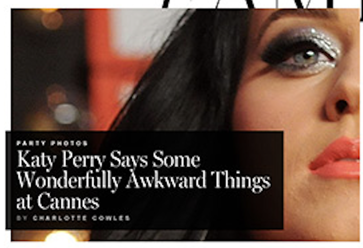
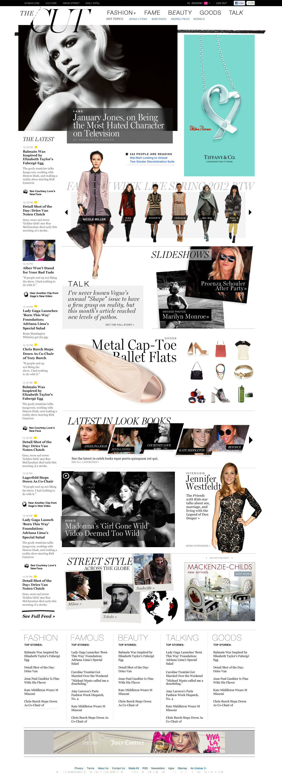
Headlines overlap images (e.g., "SLIDESHOWS" overlaid on a photo), creating a sense of dynamic tension and movement, reminiscent of high-end fashion spreads.
Grid-breaking layouts that played with scale, whitespace, and unexpected overlaps. The site felt like a living magazine—fluid, dynamic, and not afraid to disrupt the scroll.
Asymmetry & Diagonal Flow
Elements like the “SLIDESHOW” header break the grid with diagonals and image layering—a style popular in print design but less common on the web at this time.
Why It Was Ahead of Its Time:
Editorial + Commerce: Blended storytelling and shopping, foreshadowing today’s “shop the story” trends.
Print-Inspired Design: Used bold imagery, layered text, and asymmetry.
Touch-First Aesthetic: Designed for scrolling and visual browsing, ideal for mobile and tablet users.
Emotion Over Utility: Focused on vibe and desire, not just product specs—setting the tone for modern luxury UX.
Final Designs
Editorial-Driven Branding.
A design system that felt high-fashion, but never cold or inaccessible. Focusing on strong typographic hierarchy and a minimalist layout grid.


Results + Impact
The Cut became one of New York Magazine’s most iconic and successful digital verticals. The design style has proven sticky and widely influential — the visual and UX language has been influenced other media brands and remains a recognizable standard years later.
Additionally, The Cut plays a pivotal role in New York Magazine's subscription strategy. Over 50% of the publication's top-converting stories for subscriptions originate from The Cut each month . This underscores its influence and engagement within the digital media landscape.
The format inspired structural models for other NYMag verticals and played a key role in positioning The Cut as a leader in editorial feminism, intersectional journalism, and modern lifestyle media.
Influential with Editorial-Commerce Hybrids like Man Repeller (pre-closure), Who What Wear, Coveteur, Refinery29
- The Cut pioneered a layout where editorial voice met shoppable content, inspiring brands to embed product roundups and affiliate links directly into smart, opinionated stories.
- Mixed "lipstick and legislation" became a content model replicated across fashion/lifestyle media.
Photo-Illustration + Mixed Media Styles
Influenced: Nylon redesigns, Rookie Mag, Into the Gloss visuals, later iterations of The New York Times’ “Style” section
- The Cut’s gritty, collage-like illustration style—raw, dynamic, textured—sparked a movement away from clean vector art toward human, emotional, hand-crafted visuals in fashion and pop culture design.
Scroll-Loving, Mobile-First Editorial Sites
Influenced: Modern DTC brand blogs, Instagram editorial strategy, Pop Sugar redesigns
- Their layouts anticipated the swipe-scroll behavior that would become the default in mobile UX, using bold imagery, layered type, and vertical storytelling to guide users instead of relying on heavy navigation menus.
179%
Increase in traffic
In first year, climbing to 3 million monthly unique visitors/month.
7 mill
Monthly visitors/mo
Over the next 2 years visitors increased 130% to 7 million visits/months.
1st place
SPD Gold Medal for Best Web Design
The SPD Award, given by the Society of Publication Designers, is one of the highest honors in editorial design. It recognizes excellence in visual storytelling across print and digital media. Winning an SPD signifies not just aesthetic achievement, but creative leadership and influence.
Reflections
Editorial design requires deep understanding of content voice — our design system had to amplify rather than overshadow.
Balancing rigor and personality in a brand system was the ultimate creative challenge.
Brand Is ProductBrand definition and UX are inseparable — especially in content-driven products. Every design decision had to support both editorial voice and long-term scalability.
Systems Thinking from the StartBuilt a mobile first, modular, scalable editorial layout system — a foundation for my later design systems work.
Designing for EngagementSuccess came from user-centered layout decisions — optimized for scan-ability, sharing, and editorial flexibility.
Thank you!
Next case study >
Get in touch
Connect with me to learn more.
Work
➔
About
➔
➔
@ Alicia Brooks
2025
All Rights Reserved
Work
About
Creating The Cut
A new fashion destination for New York Magazine
Case Study
Introduction
While at New York Magazine, I created the visual design and digital branding for The Cut — a sharp, stylish, and culturally resonant digital destination. Originally launched as a fashion blog, The Cut became a stand-alone vertical in 2012, and by 2017 had broadened its scope to include Style, Self, Culture, and Power — a deliberate editorial shift beyond fashion. My work was central to this transformation. Partnering closely with the Creative Director, Product Owners, and Editorial leadership (including then-editorial director Stella Bugbee and Editor-in-Chief Adam Moss), I helped define The Cut's digital identity, structure, and voice — ensuring it stood apart from both traditional fashion magazines and lifestyle blogs.
Role
Lead designer, 4 person design team
Team
4 Designers, 7 Developers, 1 Product Owner, 1 Dev Lead
Timeline
2 months (4 sprints)
Tools
Figma, Mural, Jira, Storybook, IBM Carbon Design System
Scope of work
- Product + Visual + UX Designer
- Designed visual identity (logo, typography, color, layout, illustration style)
- Editorial UX patterns and responsive systems
- Designed visual identity (logo, typography, color, layout, illustration style)
- Editorial UX patterns and responsive systems
- UX & Homepage and content taxonomy for the new sections: Style, Self, Culture, Power
- Design system to support editorial workflows
- Collaborative reviews with editorial leadership
Project Goals
01
Brand The Cut as a distinct digital vertical under New York Magazine
02
Reflect its expanded editorial focus beyond fashion
03
Establish a bold, mobile-first design system
04
Compete with established fashion media while offering substantive, feminist, and culturally aware content
05
Increase engagement through editorial flexibility and strong visual storytelling
Design Process
Research
Competitive audit
Competitive audit of fashion and culture sites to find white space
Editorial interviews
Editorial interviews to define tone, voice, and structure
Technical Req
- Technical constraints analysis for responsive performance
- UX research to map reader engagement habits on mobile
Key Findings
The Cut’s editorial POV demanded a design that was both polished and pointed — with room for both fashion galleries and serious journalism.
Branding
Visual Identity / Logo
Unlike traditional fashion publications, The Cut didn’t just cover trends — it offered a witty, unfiltered take on power, identity, and culture. The brand voice was:
- Intelligent but approachable
- Playfully provocative, yet journalistically rigorous
- Comfortable covering both lipstick and legislation, often in the same breath
Design needed to reflect this editorial ethos — strong, clean, bold, and flexible enough to house everything from fashion week recaps to longform essays on politics, power, and gender.
Logo:
All-caps, serif, and unapologetically bold. The logo felt classic but with a modern bite—anchoring the brand as both fashion-forward and intellectually serious.
Typography:
A confident mix of high-contrast serifs and clean sans-serifs created tension and elegance, echoing the way The Cut tackled soft lifestyle topics with hard-edged analysis.
Photo illustration style
We developed a bold, expressive illustration style that reflects The Cut’s position as a cutting-edge destination for fashion and culture. These illustrations go beyond decoration—they act as visual storytelling tools that deepen editorial impact and foster emotional connection.
- The style amplifies the brand’s voice: unapologetically bold, intellectually provocative, and visually magnetic—perfect for an audience that embraces both high fashion and cultural critique.
- Edgy & Inclusive: The illustrations reflect The Cut’s diverse and progressive ethos, embracing complexity over perfection.
- Vibrant, High-Contrast Color: A saturated palette—reds, pinks, purples, and rich neutrals—echoes the brand’s fearless tone and high-energy editorial rhythm.
- Expressive, Dynamic Figures: Loosely rendered, stylized forms celebrate individuality, movement, and attitude—challenging the conventions of traditional fashion illustration.
- Playful Yet Polished: Often incorporating collage, ink, or hand-drawn textures, the illustrations strike a balance between raw creativity and editorial sophistication.
- Together, this approach created a visual language as distinctive and multidimensional as The Cut itself, capable of elevating both a fashion week recap and a sharp essay on gender politics.
User Experience
Responsive Architecture
- Designed a mobile-first interface (ahead of trend in 2017).
- Created templates that worked for both quick hits and deep reads.
Section Identity & UX
- Introduced clear navigational structures for Style, Self, Culture, Power.
- Ensured each section had a distinct editorial rhythm but consistent design patterns.
CMS-Compatible Flexibility
- Designed with editorial usability in mind — allowing non-designers to build compelling layouts easily.
Layout Choices
Layered Typography & Layout
Headlines overlap images (e.g., "SLIDESHOWS" overlaid on a photo), creating a sense of dynamic tension and movement, reminiscent of high-end fashion spreads.
Grid-breaking layouts that played with scale, whitespace, and unexpected overlaps. The site felt like a living magazine—fluid, dynamic, and not afraid to disrupt the scroll.
Asymmetry & Diagonal Flow
Elements like the “SLIDESHOW” header break the grid with diagonals and image layering—a style popular in print design but less common on the web at this time.
Why It Was Ahead of Its Time:
Editorial + Commerce: Blended storytelling and shopping, foreshadowing today’s “shop the story” trends.
Print-Inspired Design: Used bold imagery, layered text, and asymmetry.
Touch-First Aesthetic: Designed for scrolling and visual browsing, ideal for mobile and tablet users.
Emotion Over Utility: Focused on vibe and desire, not just product specs—setting the tone for modern luxury UX.
Final Designs
Editorial-Driven Branding.
A design system that felt high-fashion, but never cold or inaccessible. Focusing on strong typographic hierarchy and a minimalist layout grid.
Results + Impact
The Cut became one of New York Magazine’s most iconic and successful digital verticals. The design style has proven sticky and widely influential — the visual and UX language has been influenced other media brands and remains a recognizable standard years later.
Additionally, The Cut plays a pivotal role in New York Magazine's subscription strategy. Over 50% of the publication's top-converting stories for subscriptions originate from The Cut each month . This underscores its influence and engagement within the digital media landscape.
The format inspired structural models for other NYMag verticals and played a key role in positioning The Cut as a leader in editorial feminism, intersectional journalism, and modern lifestyle media.
Influential with Editorial-Commerce Hybrids like Man Repeller (pre-closure), Who What Wear, Coveteur, Refinery29
- The Cut pioneered a layout where editorial voice met shoppable content, inspiring brands to embed product roundups and affiliate links directly into smart, opinionated stories.
- Mixed "lipstick and legislation" became a content model replicated across fashion/lifestyle media.
Photo-Illustration + Mixed Media Styles
Influenced: Nylon redesigns, Rookie Mag, Into the Gloss visuals, later iterations of The New York Times’ “Style” section
- The Cut’s gritty, collage-like illustration style—raw, dynamic, textured—sparked a movement away from clean vector art toward human, emotional, hand-crafted visuals in fashion and pop culture design.
Scroll-Loving, Mobile-First Editorial Sites
Influenced: Modern DTC brand blogs, Instagram editorial strategy, Pop Sugar redesigns
- Their layouts anticipated the swipe-scroll behavior that would become the default in mobile UX, using bold imagery, layered type, and vertical storytelling to guide users instead of relying on heavy navigation menus.
179%
Increase in traffic
In first year, climbing to 3 million monthly unique visitors/month.
7 mill
Monthly visitors/mo
Over the next 2 years visitors increased 130% to 7 million visits/months.
1st place
SPD Gold Medal for Best Web Design
The SPD Award, given by the Society of Publication Designers, is one of the highest honors in editorial design. It recognizes excellence in visual storytelling across print and digital media. Winning an SPD signifies not just aesthetic achievement, but creative leadership and influence.
Reflections
Editorial design requires deep understanding of content voice — our design system had to amplify rather than overshadow.
Balancing rigor and personality in a brand system was the ultimate creative challenge.
Brand Is ProductBrand definition and UX are inseparable — especially in content-driven products. Every design decision had to support both editorial voice and long-term scalability.
Systems Thinking from the StartBuilt a mobile first, modular, scalable editorial layout system — a foundation for my later design systems work.
Designing for EngagementSuccess came from user-centered layout decisions — optimized for scan-ability, sharing, and editorial flexibility.
Thank you!
Next case study >
Get in touch
Connect with me to learn more.
Work
➔
About
➔
➔
@ Alicia Brooks
2025
All Rights Reserved
Work
About
Creating The Cut
A new fashion destination for New York Magazine
Case Study
Introduction
While at New York Magazine, I created the visual design and digital branding for The Cut — a sharp, stylish, and culturally resonant digital destination. Originally launched as a fashion blog, The Cut became a stand-alone vertical in 2012, and by 2017 had broadened its scope to include Style, Self, Culture, and Power — a deliberate editorial shift beyond fashion. My work was central to this transformation. Partnering closely with the Creative Director, Product Owners, and Editorial leadership (including then-editorial director Stella Bugbee and Editor-in-Chief Adam Moss), I helped define The Cut's digital identity, structure, and voice — ensuring it stood apart from both traditional fashion magazines and lifestyle blogs.
Role
Interaction designer on 2 person design team
Team
Creative director, PM, 6 Developers, Product Owner,
Timeline
6 months (12 sprints)
Tools
Sketch, Photoshop, Figma, Mural, Jira
Scope of work
- Product + Visual + UX Designer
- Designed visual identity (logo, typography, color, layout, illustration style)
- Editorial UX patterns and responsive systems
- Designed visual identity (logo, typography, color, layout, illustration style)
- Editorial UX patterns and responsive systems
- UX & Homepage and content taxonomy for the new sections: Style, Self, Culture, Power
- Design system to support editorial workflows
- Collaborative reviews with editorial leadership
Project Goals
01
Brand The Cut as a distinct digital vertical under New York Magazine
02
Reflect its expanded editorial focus beyond fashion
03
Establish a bold, mobile-first design system
04
Compete with established fashion media while offering substantive, feminist, and culturally aware content
05
Increase engagement through editorial flexibility and strong visual storytelling
Design Process
Research
Competitive audit
Competitive audit of fashion and culture sites to find white space
Editorial interviews
Editorial interviews to define tone, voice, and structure
Technical Req
- Technical constraints analysis for responsive performance
- UX research to map reader engagement habits on mobile
Key Findings
The Cut’s editorial POV demanded a design that was both polished and pointed — with room for both fashion galleries and serious journalism.
Branding
Visual Identity / Logo
Unlike traditional fashion publications, The Cut didn’t just cover trends — it offered a witty, unfiltered take on power, identity, and culture. The brand voice was:
- Intelligent but approachable
- Playfully provocative, yet journalistically rigorous
- Comfortable covering both lipstick and legislation, often in the same breath
Design needed to reflect this editorial ethos — strong, clean, bold, and flexible enough to house everything from fashion week recaps to longform essays on politics, power, and gender.
Logo:
All-caps, serif, and unapologetically bold. The logo felt classic but with a modern bite—anchoring the brand as both fashion-forward and intellectually serious.
Typography:
A confident mix of high-contrast serifs and clean sans-serifs created tension and elegance, echoing the way The Cut tackled soft lifestyle topics with hard-edged analysis.
Photo illustration style
We developed a bold, expressive illustration style that reflects The Cut’s position as a cutting-edge destination for fashion and culture. These illustrations go beyond decoration—they act as visual storytelling tools that deepen editorial impact and foster emotional connection.
- The style amplifies the brand’s voice: unapologetically bold, intellectually provocative, and visually magnetic—perfect for an audience that embraces both high fashion and cultural critique.
- Edgy & Inclusive: The illustrations reflect The Cut’s diverse and progressive ethos, embracing complexity over perfection.
- Vibrant, High-Contrast Color: A saturated palette—reds, pinks, purples, and rich neutrals—echoes the brand’s fearless tone and high-energy editorial rhythm.
- Expressive, Dynamic Figures: Loosely rendered, stylized forms celebrate individuality, movement, and attitude—challenging the conventions of traditional fashion illustration.
- Playful Yet Polished: Often incorporating collage, ink, or hand-drawn textures, the illustrations strike a balance between raw creativity and editorial sophistication.
- Together, this approach created a visual language as distinctive and multidimensional as The Cut itself, capable of elevating both a fashion week recap and a sharp essay on gender politics.
User Experience
Responsive Architecture
- Designed a mobile-first interface (ahead of trend in 2017).
- Created templates that worked for both quick hits and deep reads.
Section Identity & UX
- Introduced clear navigational structures for Style, Self, Culture, Power.
- Ensured each section had a distinct editorial rhythm but consistent design patterns.
CMS-Compatible Flexibility
- Designed with editorial usability in mind — allowing non-designers to build compelling layouts easily.
Layout Choices
Layered Typography & Layout
Headlines overlap images (e.g., "SLIDESHOWS" overlaid on a photo), creating a sense of dynamic tension and movement, reminiscent of high-end fashion spreads.
Grid-breaking layouts that played with scale, whitespace, and unexpected overlaps. The site felt like a living magazine—fluid, dynamic, and not afraid to disrupt the scroll.
Asymmetry & Diagonal Flow
Elements like the “SLIDESHOW” header break the grid with diagonals and image layering—a style popular in print design but less common on the web at this time.
Why It Was Ahead of Its Time:
Editorial + Commerce: Blended storytelling and shopping, foreshadowing today’s “shop the story” trends.
Print-Inspired Design: Used bold imagery, layered text, and asymmetry.
Touch-First Aesthetic: Designed for scrolling and visual browsing, ideal for mobile and tablet users.
Emotion Over Utility: Focused on vibe and desire, not just product specs—setting the tone for modern luxury UX.
Final Designs
Editorial-Driven Branding.
A design system that felt high-fashion, but never cold or inaccessible. Focusing on strong typographic hierarchy and a minimalist layout grid.
Results + Impact
The Cut became one of New York Magazine’s most iconic and successful digital verticals. The design style has proven sticky and widely influential — the visual and UX language has been influenced other media brands and remains a recognizable standard years later.
Additionally, The Cut plays a pivotal role in New York Magazine's subscription strategy. Over 50% of the publication's top-converting stories for subscriptions originate from The Cut each month . This underscores its influence and engagement within the digital media landscape.
The format inspired structural models for other NYMag verticals and played a key role in positioning The Cut as a leader in editorial feminism, intersectional journalism, and modern lifestyle media.
Influential with Editorial-Commerce Hybrids like Man Repeller (pre-closure), Who What Wear, Coveteur, Refinery29
- The Cut pioneered a layout where editorial voice met shoppable content, inspiring brands to embed product roundups and affiliate links directly into smart, opinionated stories.
- Mixed "lipstick and legislation" became a content model replicated across fashion/lifestyle media.
Photo-Illustration + Mixed Media Styles
Influenced: Nylon redesigns, Rookie Mag, Into the Gloss visuals, later iterations of The New York Times’ “Style” section
- The Cut’s gritty, collage-like illustration style—raw, dynamic, textured—sparked a movement away from clean vector art toward human, emotional, hand-crafted visuals in fashion and pop culture design.
Scroll-Loving, Mobile-First Editorial Sites
Influenced: Modern DTC brand blogs, Instagram editorial strategy, Pop Sugar redesigns
- Their layouts anticipated the swipe-scroll behavior that would become the default in mobile UX, using bold imagery, layered type, and vertical storytelling to guide users instead of relying on heavy navigation menus.
179%
Increase in traffic
In first year, climbing to 3 million monthly unique visitors/month.
7 mill
Monthly visitors/mo
Over the next 2 years visitors increased 130% to 7 million visits/months.
1st place
SPD Gold Medal for Best Web Design
The SPD Award, given by the Society of Publication Designers, is one of the highest honors in editorial design. It recognizes excellence in visual storytelling across print and digital media. Winning an SPD signifies not just aesthetic achievement, but creative leadership and influence.
Reflections
Editorial design requires deep understanding of content voice — our design system had to amplify rather than overshadow.
Balancing rigor and personality in a brand system was the ultimate creative challenge.
Brand Is ProductBrand definition and UX are inseparable — especially in content-driven products. Every design decision had to support both editorial voice and long-term scalability.
Systems Thinking from the StartBuilt a mobile first, modular, scalable editorial layout system — a foundation for my later design systems work.
Designing for EngagementSuccess came from user-centered layout decisions — optimized for scan-ability, sharing, and editorial flexibility.

Thank you!
Next case study >
Get in touch
Connect with me to learn more.
Work
➔
About
➔
➔
@ Alicia Brooks
2025
All Rights Reserved