Some of my favorites from Fashion Week

Antonio Berardi 

Isabel Marant - Her large and powerful shapes are still so womanly.

Marc Jacobs 

Rochas - Amelia Earhart meets a comic book villian.

Nina Ricci 


Dries Van Noten - Again, love these dramatic party-on-the-top shapes and slim/delicate bottoms.

October

Some old, new and classic images that are inspiring me for fall.

1 Backstage Fashion week.

 2 Charlotte Gainsbourg, I find something so indescribably charming about her graceful imperfection. Similar to the lifestyle image J.Crew is conjuring up lately.

3 David Lynch and Isabella Rossalini. The motion and the tension seem to visually capture Lynch’s work.

4 Feist. Reminds me of the farm visiting and leaf peeping I hope to get into this month.

5 1976 pics of Jerry Hall modeling in Russia by photographer Norman Parkinson. Winds of change.

6 Jean Shrimpton and Terrence Stamp in Vogue Fashion.

Working in Rockefeller Center, the Anthropologie window displays are a daily inspiration. I’m all about the unexpected proportions, organic shapes and rich textures. Some designs are almost mathematical, like fractals, often reflecting the details of the clothing in the large woven or wooden sculpture. I had to find out who did them.

Turns out… unlike a lot of national stores, each Anthro shop has its own small team of artists that do all of the display at their location.

You can see a vast gallery of displays on their Facebook page.

Really nice identity for the Edinburg Film Festival from Berg Studio. They created a visual link to a film-strip - A single typographic stack of information is repeated with the word ‘FILM’ bleeding off the edges. The condensed type is inspired by classic 50’s film posters while the texture within the word ‘FILM’ simulates handwritten editing notes on celluloid film.

Beautiful package design by Swedish company Bruto Studio.

"The goal was to achieve an elegant, strong and clean identity to help transmit the unique personality of this wine."

I love how crisp the letters look, the whitespace around each showcases their form. The logo almost comes off as formal - then the bowl of the “a” gives it some quirky personality… maybe portraying the jovial effects of wine.

I’m loving all the grid-based web design happening right now!

A Grid is an invisible structure used to guide the placement of elements on your page. It helps to create that relaxing feeling of order and hierarchy on a website.
Not only is a grid useful for visual clarity, but can create beauty and balance as it shapes the content into proportions that are pleasing to the eye. This is especially true when using proportions meant to have a natural visual elegance in relation to each other (like the Golden ratio and the Fibonacci sequence).

Some personally inspiring examples:

Check out these sites: tokyoid, bergstudio, blackestate

Calendar Trash bags Yurko Gutsulyak

Text on the calendar:

“All design products ultimately end up in trash.  And many more ideas remain just ideas. We believe that the design idea in each project should have the power to act and be effective during its short life. Only this way design really matters. Only when we create ideas that are able to change the world our life matters. Then, we do not regret a day, as we did not waste it.”

Via the Dieline

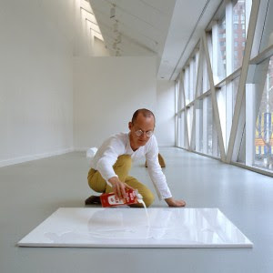
One of my favorite sculptures is Wolfgang Laib’s Milkstone - a slightly hollow white marble slab that, when filled with milk, appears to have solid, pure white surface.

Laib has created a way to make physical endlessness in natural materials, showing how two extremely different things can become one.

"A study in the relationship of fragility and immutability, Laib’s work counterposes two symbolically laden entities."

Sources 1

This book cover makes me want to eat cupcakes… as should all good pastry lit.

I love how all the fonts play against each other in this new Cookbook by Gesine Bullock-Prado. First of all, I have a font crush on Archer, a lovely Slab Serif initially commissioned for Martha Stewart Homes. The ball terminals (the droplets on the end of the letters) happily remind me of rock candy and the old school serifs with the modern skinny sans (arguably overused, but whatever) are really beautiful. Check out the detail below… and if you are interested, here is a great article on the history of the Slab Serif.